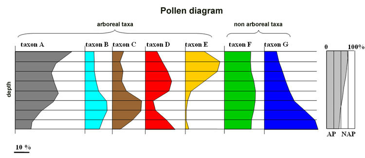
The palynological analysis aims at reconstructing the succession of vegetation in a chronological sequence.
In each sampling level of the sequence the spores and pollens are counted. At least 200 grains per slide should be counted to yield representative percentages. At each level the frequency of each taxon is expressed as a percentage of the total pollen (minus Sphagnum): this is the pollen spectrum of this level (which can be represented as a frequency histogram).
Example : level X
| taxon | number of counted grains | percentage |
| A | 20 | 10 |
| B | 19 | 9,5 |
| C | 10 | 5 |
| D | 40 | 20 |
| E | 4 | 2 |
| F | 36 | 18 |
| G | 70 | 35 |
| other/unidentified | 1 | 0,5 |
| Total | 200 | 100 % |
NB. Sphagnum spores are excluded from the sum because their spore production is quite irregular, and because of their local origin in peat bogs that would distort the regional spectrum in case of abundant spore production.

A spectrum provides an "instantaneous" image of the vegetation at a given time. The evolution of the percentage of each taxon may be observed if spores and pollens are counted in several levels. A pollen diagram is a graph on which :
- vertical axis represents depth;
- horizontal axis represents the proportional abundance of each observed taxon.

If successive samples are close enough to each other, the percentages may be interpolated and continuous curves of evolution may be plotted for each taxon.

Two groups of taxa are distinguished: arboreal pollens (AP = pollens of trees and shrubs) and non arboreal pollens (NAP = spores and pollens of herbaceous taxa).
The ratio AP/Total of each sample can be computed and plotted against depth. A high AP/Total ratio indicates a closed environment (forest), whereas a low AP/Total ratio indicates an open environment, dominated by herbaceous taxa.